Keyten
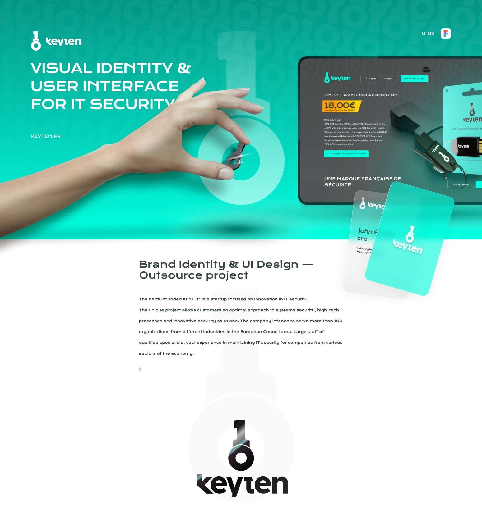
Keyten is a French startup making FIDO2 security keys — the small hardware that logs you in without passwords. We built the brand from the name out: the symbol, the product shaped like that symbol, the retail packaging, and the web shop with its mobile version. Smart. Responsible. Clever. Best.
The symbol
The name splits in two — Key and Ten — and the mark holds both: a key whose head is a 1 and a 0. Binary, because that’s what the product protects. The same glyph then became the physical shape of the key itself.
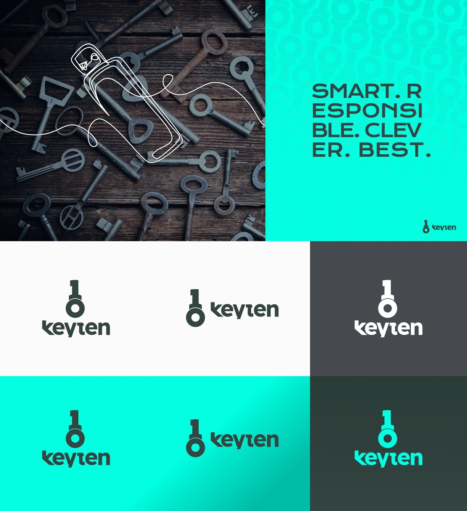
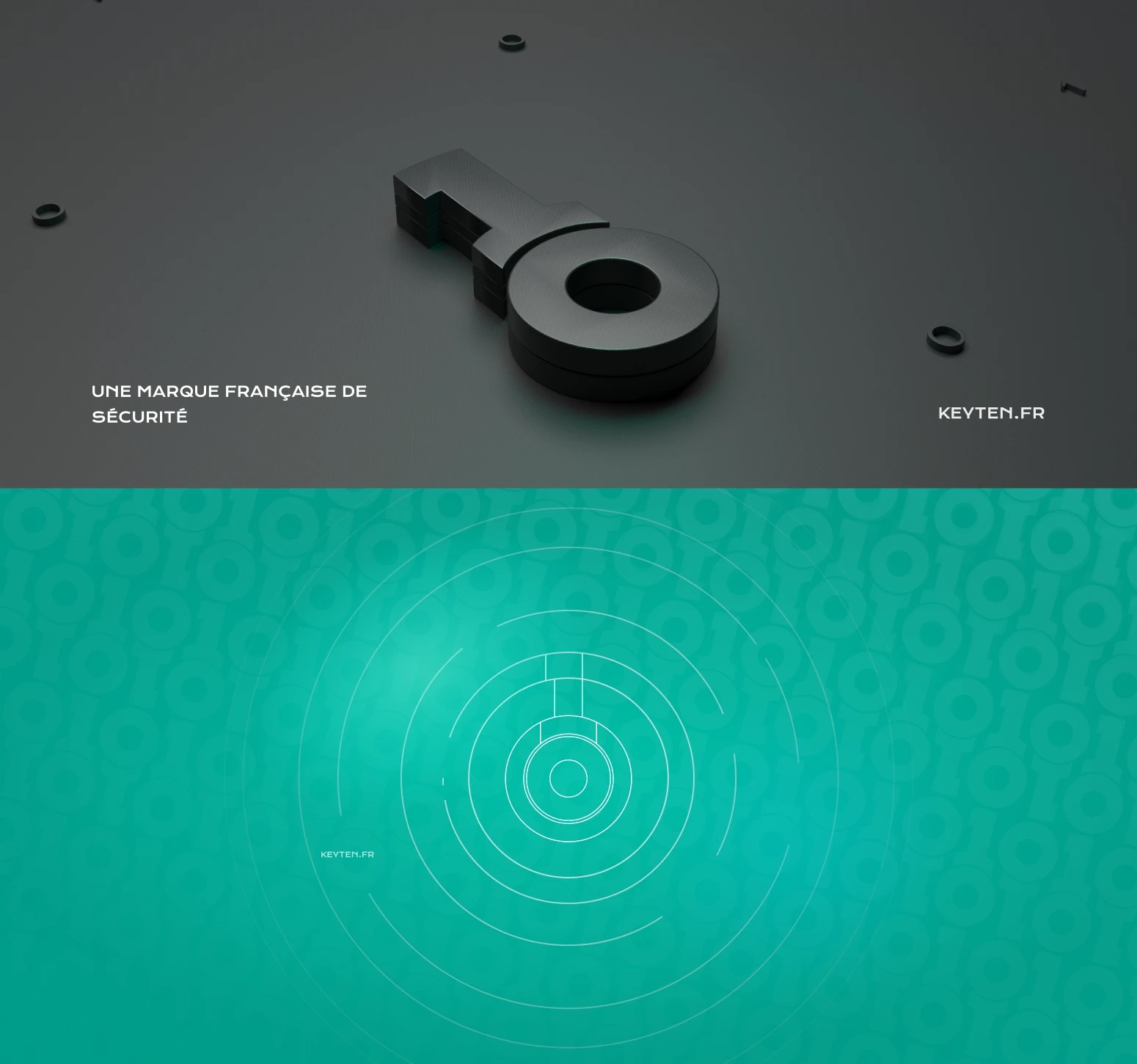
“In the company name KEYTEN, we can clearly define 2 different and common words for the security symbol as Key and 10… and of course did not forget about the binary number system.”
The system
The product
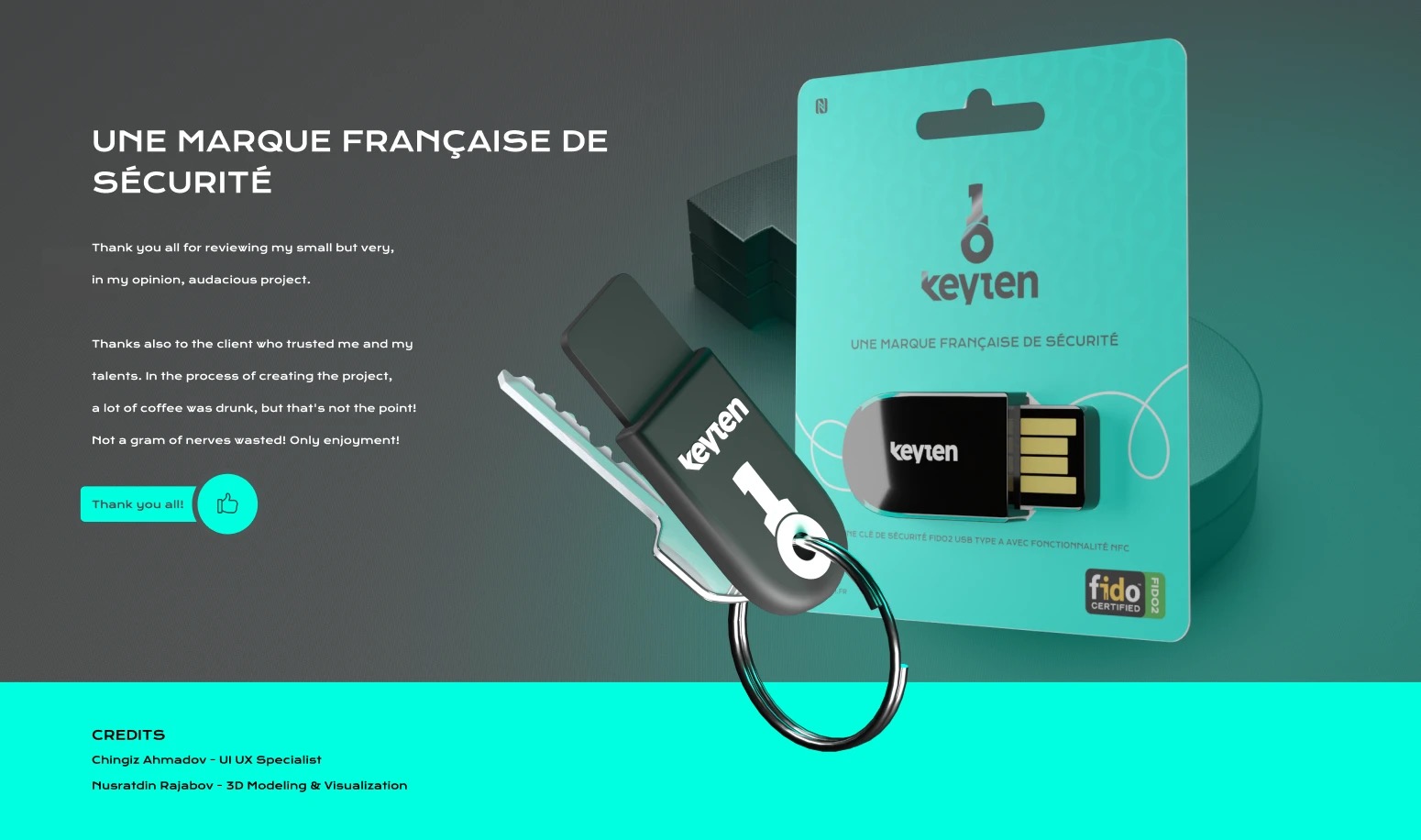
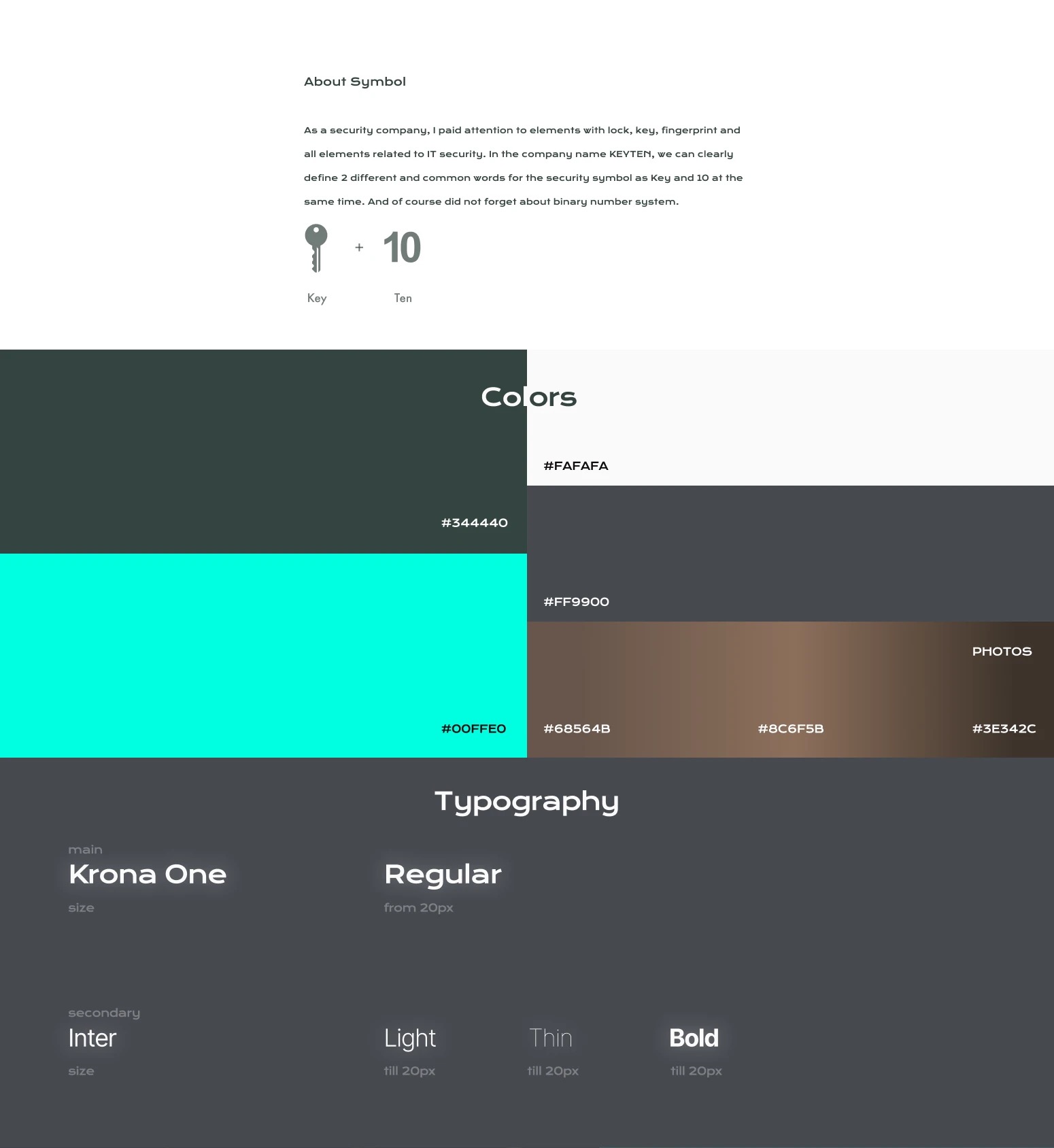
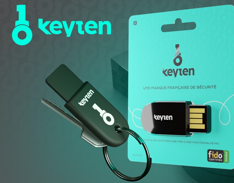
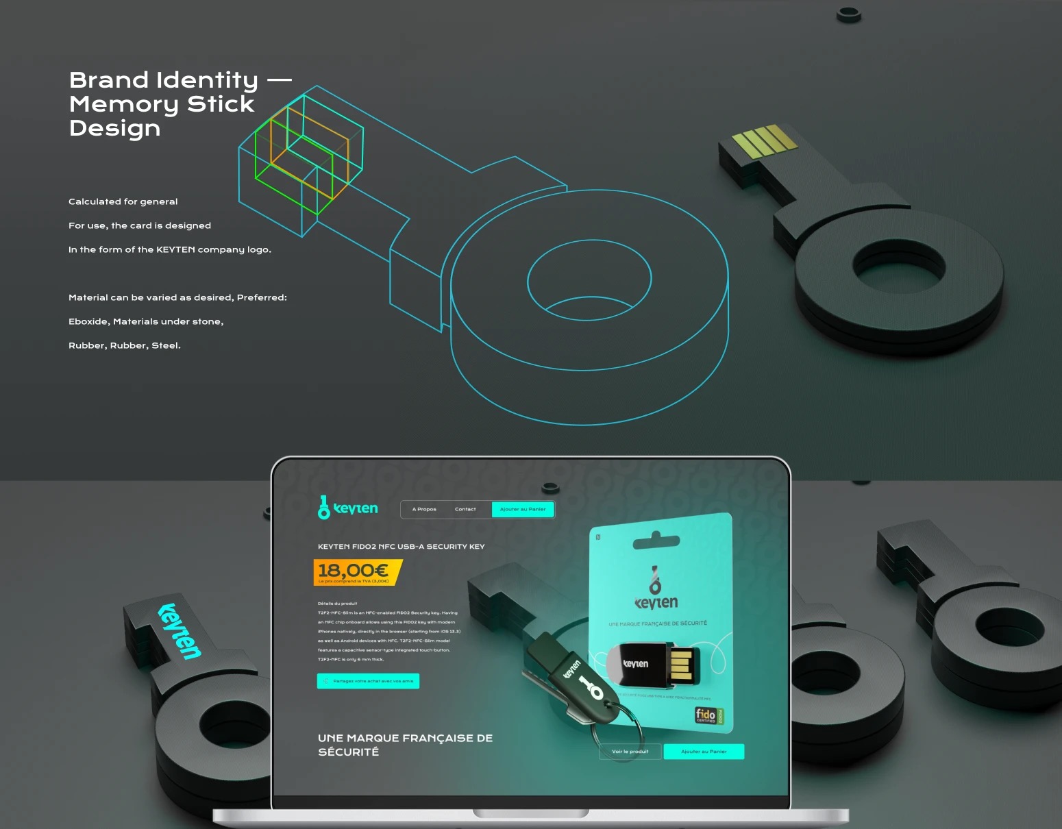
The security key was designed as the logo: a slab of dark eboxite or steel cut into the keyten shape, on a keyring, beside retail blister packaging that carries the mark and the FIDO certification.
The website
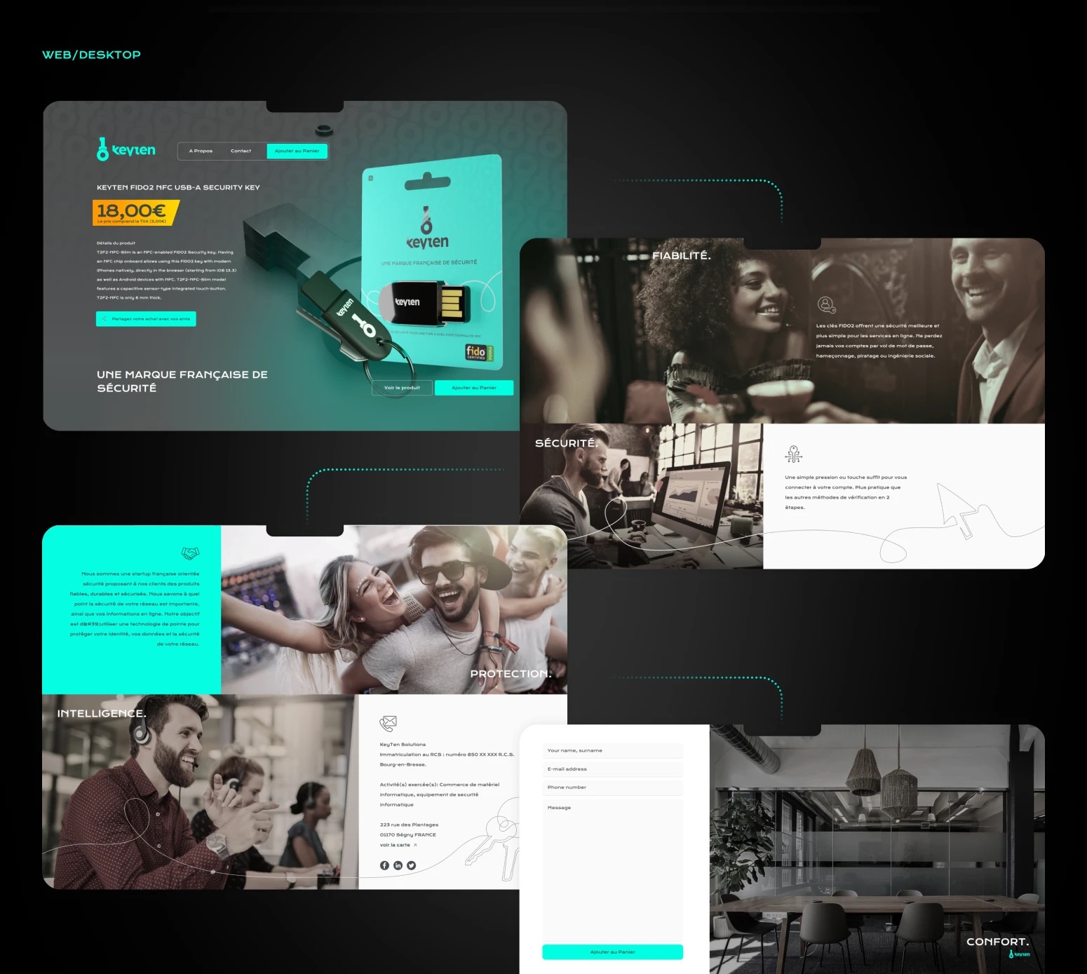
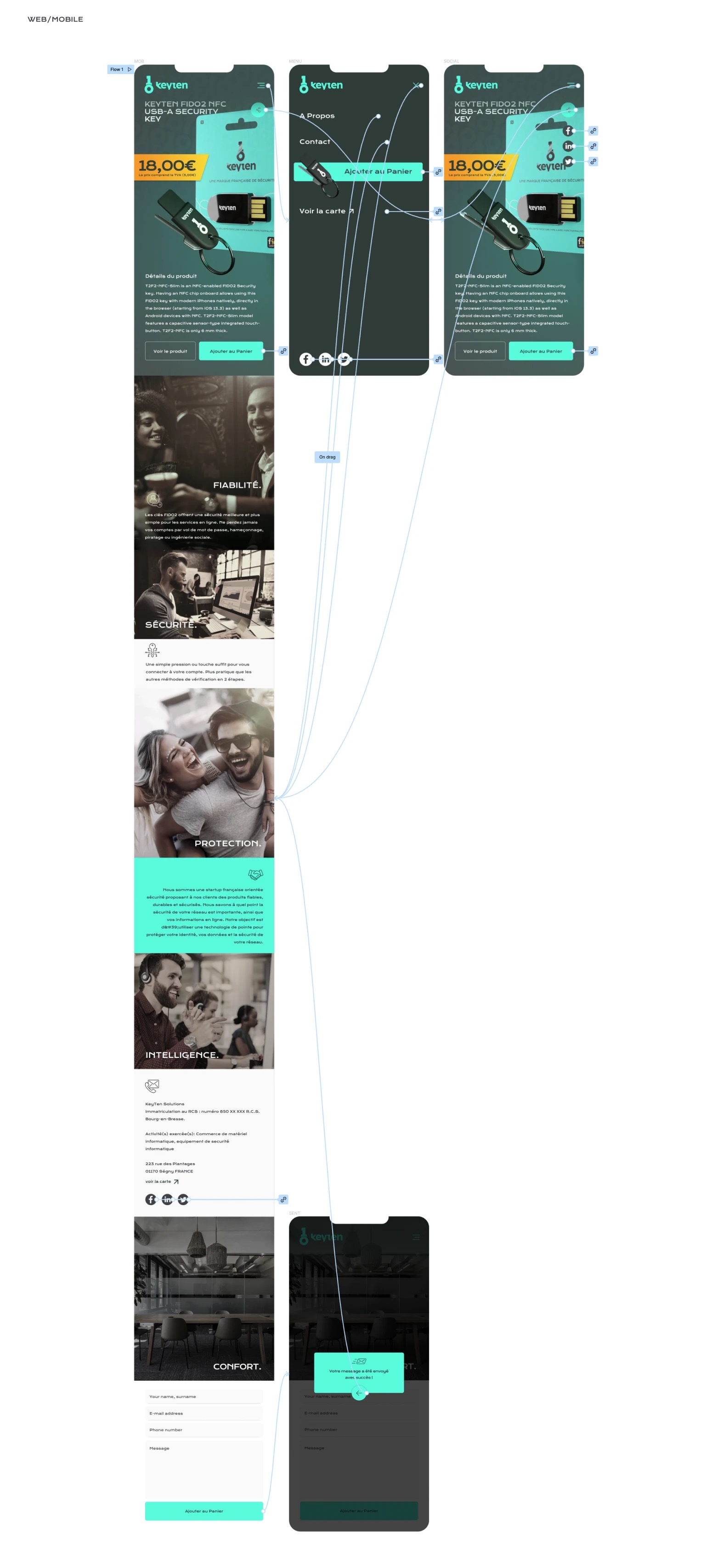
A one-product shop in French: the FIDO2 NFC USB-A key at 18,00 €, connected by dotted circuit lines to the brand’s five promises — fiabilité, sécurité, protection, intelligence, confort — and a contact form under a legal footer. Fully designed for mobile alongside desktop.